This is the final complete draft of my music video. It has taken a long time and I have put a lot of effort in and hopefully it has all payed off. I have really enjoyed creating my music video, as I didn't find it as work but more as a chance to expand my creativity. I have learned a lot over the past year about music products and how they are developed and constructed. I believe I have successfully campaigned my Media product by reaching my goals of relating it to my chosen genre, producing a clear structured narrative and overall advertising a successful media text.
Tuesday 29 April 2014
Final Complete Draft You and Me -Disclosure
This is the final complete draft of my music video. It has taken a long time and I have put a lot of effort in and hopefully it has all payed off. I have really enjoyed creating my music video, as I didn't find it as work but more as a chance to expand my creativity. I have learned a lot over the past year about music products and how they are developed and constructed. I believe I have successfully campaigned my Media product by reaching my goals of relating it to my chosen genre, producing a clear structured narrative and overall advertising a successful media text.
Monday 28 April 2014
Final Ancillary Texts

I decided to use this design as my final one because I got various people to look at each ancillary texts and for the to give me there feedback on both and tell me which one they believe to be a better representative and more engaging. They said that this one linked more with my 3 media products and brings them all together more. You can see that they all relate and express the meaning across as they all have to same conventions. The colour scheme is the same, the imagery used is also the same and this was to create links between the two ancillary texts. I believe my ancillary text stood out and emphasised what I am wanting to represent.

Friday 11 April 2014
Evaluation Question 1: In what way does your media product use, develop or challenge forms and conventions of real media products?
A2 Media Studies Evaluation
The ways my media product uses
forms and conventions of real media texts, is through my development and
researching. I began by researching my chosen genre of music and looking at
other media texts. Music videos of today are categorised into 3 different
types, performance, abstract and narrative. Although you can have 2 of these
categories together, for example, the song by Paramore ‘Still into you’ is an
abstract video as it has no narrative but is expressing the song through
movement, although, there is some performance in there as well. Whereas narrative is telling a story within
the video, and this is what I chose. The song I chose was ‘me and you’ by the
popular djs Disclosure. I liked the beat of the music and I had a lot of ideas
when listening to the song. I looked at various media texts that link with the
genre of ‘House music’ and here I discovered what conventions of form and genre
I would need to consider in my music video.
Examples of this would be for
cinematography mid shots, close ups and steadi cam. This is because it engages
the audience making them feel like they are there in on the action. It’s a good
way for the audience to communicate and understand the emotion and expression
from the media text. For mise en scene
the areas are represented as the lower class, run down and graffiti.
Furthermore the costume is represented quite retro and a lot of top brands are
worn by the types of people who are represented with the genre (Nike, New
Balance, Obey) I found this by looking
at other music videos done by the artist, Disclosure. For example the video
‘white noise’ really expresses all the conventions of form. It is set in a very
run down area, the main character is represented as the lower class and he is
dancing. There is a lot of graffiti and abandoned areas. These representations are put across like this
because house music isn’t a type of music the upper class would engage in. It’s
similar to the ‘rave’ type of music, which influences, drinking, drugs, dancing
and these associates with the lower class. Although house music isn’t all these
aspects, it can have a narrative or no narrative at all. There is a stuck
stereotype with this genre that people associate drinking dancing etc. when
really it can be anything it wants to be. An example of this would be the music
video by ‘Clean Bandit- Rather Be’, this is a similar type of genre of music
but the video is not represented to how the stereotype is. A Chinese woman is
miming the song and she goes around a fish market. This genre can be represented with a
narrative or with no narrative at all. Although it has a very strong stereotype
of drinking and raves etc. And I wanted to break that stereotype.
The editing for this type of genre is very
fast paced and has a lot of quick cuts, as represented in various media texts. I also did 3 Textual analyses on 3 different
media products of the same genre. This helped me as analysing the different
music videos I found similarities and the same conventions. It gave me an
understanding on how to look in depth at media products and how to deconstruct
them in the ways of conventions of genre, use of cinematography, use of
editing, deconstructing the text in relation to connotations, how the narrative
is developed and how does the text appeal to the audience. Now from researching
all of that I can reflect my understanding through my work in my ancillary
texts and media product.
From doing this is gave me a
really clear understanding of the conventions and genre aspects which I need to
include to make it a ‘house music’ media product and for my ancillary texts. For my cinematography I did a lot mid shots
and kept both the characters in shot close together. This is to emphasis the
necessity and love they have over each other. Keeping them close together in shot was an
essential to communicate to the audience that they are inseparable. Furthermore
I used a lot of steadi cam as I wanted to engage the audience even more, to
make them feel as if they were there on the journey with them. It puts them in
the place that they are there next to them, making the audience communicate
better with my media product. Furthermore I found that this type of cinematography
is presented in real media texts representing this genre. And I found this from
doing my textual analysis and looking at various media texts represented to
this genre.
I believe for my mise en scene
it was very tricky to completely influence the stereotype of house music as
getting footage of them going out and drinking would be quite difficult. So I tried a different approach of
representing the genre through editing and mise en scene. The clothing I got the
boy to wear was popular brands, for example, Nike, obey, new balance etc. This
is because the style people wear, who listen to this type of music, is quite
retro and stylish clothing. I tried to portray this but it was quite difficult
as none of them owned any, so I had to get them myself from people who I know
wear this type of clothing. For the girl, I think her own clothing fitted the
type of clothing I wanted to style her in. Although I made a few adjustments by
getting her to wear various accessories and to paint her nails red. I did this
purposely because red symbolises love and passion, linking with her
relationship and emotion. Furthermore for the setting, I picked various areas
to link with genre conventions and some that hide deeper meanings. The
abandoned area I chose because it relates to the deep house stereotype of run
down areas. I also took footage of graffiti and other run down areas. This is
because from researching and seeing that it’s a convention of this genre, I
wanted to portray that to make my media product fit this genre. The amusements I purposely chose because of
the lighting and various bright contrasting colours. This is to represent the
love and emotion of the couple’s relationship and also to fit the genre
conventions. For example house music is played at clubs and there are all
strobe lights and lasers. Furthermore when filming them by the chimney-air, I
tried to make that that was the only light near them. This is because the glow
of the fire was blazing over them. Showing again there desire and love, the
necessity they have together, that both of their hearts burn and glow with
emotion. Additionally I got fireworks
and sparklers to emphasise this same message of their emotion and lust for one
another. All these type of aspects where
to resemble not only the emotion and feelings of the two characters, but to
resemble the genre of house music.
When I came to editing my media
product I knew that the beat of the song was very fast so I had to match it
with my editing. I did this by getting the music bar at the bottom to see the
level of the beat, so I knew when to directly cut. This then allowed me to have
quick cuts of footage on the beat of the song. I mixed up my shots so every cut
they were at a different location or it was a different camera angle/shot. This
is to express the various adventures then have gone on and really shows the
amount of filming I have done and the many places we went. From feedback I have
been told that my editing is my strong point for my music video as it really
links with the house music persona, fast cuts, fast music etc.
When
creating my ancillary texts I tried to reflect the genre and forms which I
reflected in my music product also in them. I did this by using the same
characters in my music product visualised on the front as the main attraction.
I did this because in the music video they are also the main attraction so, I
got an image of them stood together facing the camera (self-reflective), making
it engaging for the audience as they are looking straight at them. It took quite
a bit of development for me to get my final ancillary texts, as shown on my
blog. I wanted the typography to be bold, contrasting and effective as it is
one of the key features that needs to be very noticeable for the audience. I looked at the typography Disclosure use and I tried to
replicate this so it relates to my artists and is a convention on the genre. I
used the font 'Tw Cen MT Condensed' for the small print but banner headline has
to be bold and contrasting as that is what the audience will see first. I put the songs on the Digi Pak in this type
because they are what I want to stand out as they are the main focus on the
back. Then I have put the featuring artists in that other type as they are not
the main focus but they are still mentioned. The image I chose for the
front will be the same image I will use for my Ancillary text, showing that I
have linked the two. I created another layer and used a brush that when printed
makes an image look battered and worn. I did this because it is one convention
of the genre. The colours I used on my Digi Pak are quite worn and rustic
colours because I wanted to represent the genre through the image. So before
even watching my media product the audience will know what type of music it is.
Furthermore from presenting the two characters on the front it gives the
audience an idea that they have a type of involvement in the video. At first I put the iconic Disclosure mask over
their faces, which instantly refers the advertisement to be a disclosure
product. Although that’s a type of copy right as it’s not my design. So from
this I adapted my own idea and crossed their eyes out. Furthermore this can have a deeper meaning,
crossing the eyes out creates mystery and it’s kind of hiding their identity.
Making the audience intrigued and wanting to find out more. It’s a strategy
that gets them drawn in, making them wants to find out and watch my media
product. I got this idea of a ‘pulse’
that you get when playing music, like a bass pulse. I liked the idea as it
looked really good and effective and house music has a lot of bass. I created
it in Photoshop and then began duplicating it and adding effects which is how I
got it to stand out and be eye catching. I then used it to put on the disks and
on the back of my Digi Pak. Then from
getting feedback from my teacher I decided to put the back ground image of my Digi
Pak the pulse design, instead
I first began thinking of ideas that I want to
link with my Digi Pak and my media product so there is a link between the two.
At first I wanted to carry the same colours across of the dark grey and the
lighter grey. Furthermore the iconic pulse across the page I have filled in a
pure white and then duplicated and added an effect to show an aftershock. This
is to imitate a music pulse/ wave you get from loud pumping music.
The images I used I purposely chose as I felt they where engaging as they are looking directly into the camera. I then edited them over Photoshop, creating the battered and old effect. I added the lyrics of chosen song as that is a convention that is involved in a music package.
I added important information in small text at the bottom to create verisimilitude. I used the colour white because it contrasts against the dark background, making it clearly visible. Then placing the pulse iconic across the image represents the type of music being advertised and what it relates to.
The banner headline is one of the key features on my ancillary texts and my Digi Pak as it is what is advertising the artist. I liked it because it is very bold and contrasting really empathizes what it is advertising. Furthermore the colours really contrast well against each other. Making it the most eye catching feature on my media text. I changed the header slightly on my Digi Pak as it believed it contrasted better against the background with the effect 'Hard Light'. The spacing between each letter emphasis the importance of each letter withing the whole word. Creating this powerful and highly structured type, representing that it is making a statement.
The banner headline for my ancillary text (on the right) I duplicated and added the effect ' Colour Burn' which is what creates this bright burning effect on the typography. I think overall the typography works really well on my ancillary text and my Digi Pak as it is one of the main focuses and really emphasis's what it is advertising. Which is the main objective for my media products.
Thursday 10 April 2014
Wednesday 9 April 2014
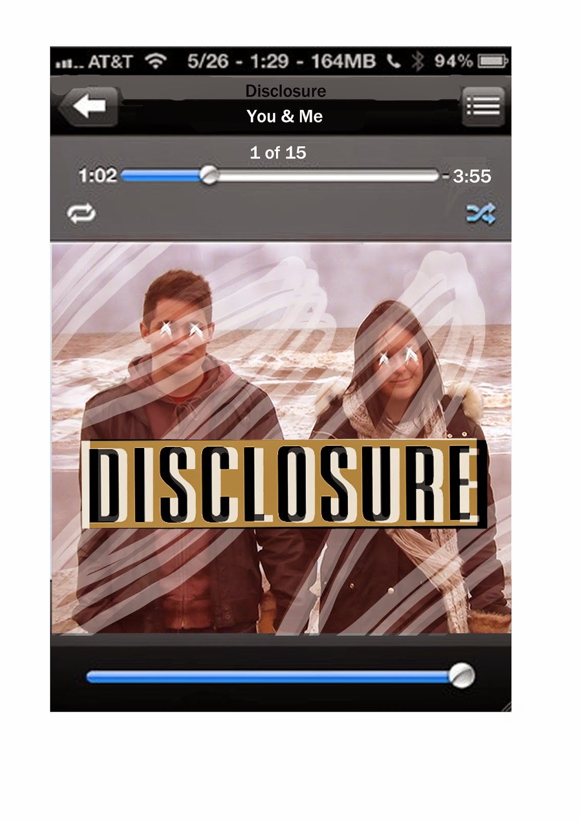
My media product on iTunes and in Teenage setting
Here is what my Media product would look like if sold on the iTunes store and then played on an apple device. I did this to show that I am thinking out side the box more and trying to relate my media campaign to the real media industry.


My target audience is aimed at teenagers so I decided to place my ancillary text in the target audiences setting. This is to show what it would be like when presented in a teenagers bedroom.
Subscribe to:
Posts (Atom)